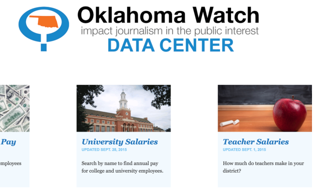
I respect and admire OklahomaWatch.org. When the people behind NonDoc got together to model our site’s ethos, that was one of the websites we sought to emulate in terms of content and tone. It’s capital-J Journalism with the public’s interest at the heart of most everything they do.
As with any media organization, the bylines behind the headlines are responsible for making the site such a great resource. Seasoned journalists all. From former Muskogee Phoenix and Tulsa World reporter Clifton Adcock to former Oklahoma Gazette staffer Ben Fenwick to 16-year Washington, D.C., correspondent for the Los Angeles Times Warren Vieth, executive editor David Fritze has a crack team of reporters and other editors at his disposal, and they regularly submit stellar work.
That being said, there is one area in which the non-profit journalism organization regularly leaves me unsatisfied, and that is their Data Center.
Since January 2014, the Oklahoma Watch Data Center has posted collections of quantitative data on topics ranging from hospital profits to lottery sales. These posts lay bare the raw figures of official numbers, and that’s mostly how they remain: raw.
Raw data is like raw fish: It takes some doing to turn it into sushi. But for most of what’s presented in the Data Center, there’s either very little or no analysis to explain potential trends and stories behind the numbers.
The Data Center’s numbers about Oklahoma superintendent salaries provide an egregious example. Although the methodology behind the data is outlined in detailed fashion, there’s no analysis to rein in the assumptions, accusations and arguing that rage in the comments section below the table. (This is actually the only DC post to have ANY substantial activity in the comments, so 18 total does constitute a rage.)
On the morning of July 2, 2014, someone posting as “Fern Real” on the superintendent data page rather poignantly asked, “It appears that some are being compensated far above others according to the census. Why is that? I realize that tenure is figured in but what else?”
Good questions! Perhaps “Fern” could’ve found some answers had he or she been directed to Nate Robson’s brief article posted the same day as the related data table, in which a breakdown of factors behind the data is given. At the very least, someone from Oklahoma Watch could have posted the linked article as a reply to the comment, but they did not. (A lengthy Robson article with a headline asking “Is Oklahoma spending too much on school administration?” was linked from the data set, but it does not analyze the data.)
Data Center’s other data
Looking at other posts in the DC, some of the tables present the data in a cumbersome way, making it difficult and unlikely any intrepid souls would be willing to extrapolate their own conclusions (assuming that’s the intended function given the lack of provided analysis).
For example, in an April 2015 post about school suspensions by race, the maximum number of entries to display is 100, but there are a total of 1,774 entries. That means people would have to cycle through 18 pages of data to compile their own spreadsheet of comprehensive numbers for this study. Without a link to download the original spreadsheet file, it seems counterproductive to present so much potentially interesting data without making it easily accessible to those who might actually want to use it. Likewise, a post about the bottom 25 percent of students at each school in the state sets 100 as the maximum viewable entries, but there are 1,741 entries.
(It should be noted that the issue of racial disparities among school suspensions is discussed in several articles over at the normal Oklahoma Watch site, but without links or internal keys, how would anyone know?)
To reiterate: I like and value the people and character behind Oklahoma Watch as a whole. To go back to the idea of data as fish, Oklahoma Watch is made of master chefs.
So, where’s the sushi?
There’s reason to be optimistic, though: As recently as Dec. 21, Oklahoma Watch posted intern Victor Henderson’s article about classroom diversity with paired data and analysis components on the same page.
One trollish (and unanswered) comment the next day notwithstanding, this kind of post should appear more frequently, because it’s frustrating that such a staid news organization with so much financial backing often can’t analyze or at least link to analysis when it posts data-heavy stories. Likewise, I wish the data were more user-friendly.


