


Embroiled in the first real pandemic of our lifetimes, we are suddenly facing numerous health decisions we were never prepared to make: Should I return to work? Can I hug my best friend? Can my parents finally hold their newborn grandchild for the first time?
These new decisions range in consequence from trivial to potentially life threatening, and it is nearly impossible to find the information we need in order to make them.
Morsels of data zoom past us every day, like dim sum served by speed skaters, and though researchers will be digging into those numbers for years to come, the average person is usually trying to understand just a few things. We want to know how quickly the virus is spreading right now, and we want to know if it’s getting better or worse. This is the information that can help us get a sense of the risks we and our loved ones might face.
The information we use to help us navigate these unprecedented times should be clear. You should be able to look at a number or graph, easily read what it says and then apply it to your decision. Additionally, the information must be relevant. If you are wondering whether or not the virus has spread more rapidly after restaurants opened up, simply looking at the total number of new cases on one specific day does not help — you need to know what’s been happening to the numbers over time.
Speaking to friends and family, I realized that many of them have struggled to know what to do with all the information out there. I have always been a numbers guy, and have spent the last three years working as a data specialist in the insurance industry. So I decided to dust off my cape, lower my eye mask to cover my nose and mouth, and see if I could help my fellow Oklahomans make sense of it all.
The numbers you don’t need
There are several popular data points that frequently roll across our screens and off our tongues but don’t actually tell us much about what’s going on or about risks. So let’s start by eliminating a few of those.
First — at the risk of sounding callous — deaths. Focusing too much on climbing death tolls can inadvertently desensitize us to the real human meaning of those numbers. Plus, they aren’t a good way to determine how the virus is spreading right now. According to a World Health Organization study of early data from China, it takes between two and eight weeks from symptom onset for a case to end in a casualty, so the lag in the data is too long to give us any reflection of current activity.
Second, hospitalizations. This metric has quickly become a go-to for Oklahoma’s Gov. Kevin Stitt as he drives us through the phases of his OURS Plan like a grizzled ranch hand on the home stretch of a cattle drive. Stitt led his April 22nd press conference with hospitalizations, touted it again the following week as chief justification to begin phase one of reopening, and again on May 14th as we entered phase two.
Like deaths, however, hospitalizations suffer from a significant data lag, since COVID-19 can incubate for as long as 14 days before it begins to overwhelm its victim to the point of needing inpatient care.
Additionally, hospitalization numbers tell us only about the most severe cases, which are just the tip of the iceberg.
Recoveries are encouraging to hear about, but, again, they don’t really do anything to inform our decisions today. Likewise, pie chart breakdowns of different demographics might give us a tiny glimpse into the swampy bogs of our country’s racial, class and generational inequities, but they are usually of limited use to individuals on the ground.
The numbers you do need
On to the good news. There are two important data points that, in combination, tell us what we need: new cases and new tests. The Oklahoma State Department of Health’s coronavirus webpage has this data, but I prefer the format of COVID Tracking Project’s chronological log.
Just looking at numbers on a daily basis isn’t helpful, however. For one thing, test results don’t always make their way into public reports right away, or they come in in batches, so the numbers tend to jump around. The information could paint very different pictures depending on which day you happen to look.
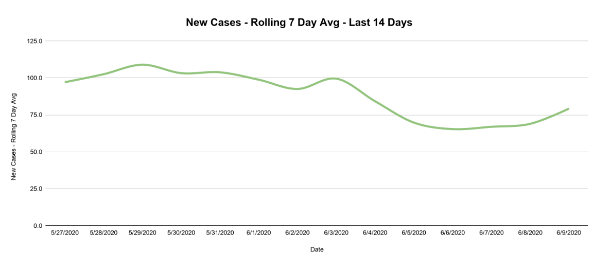
When trying to analyze data points that fluctuate this greatly, you have to enlist the powers of my old friend the rolling average. This technique “smooths” data fluctuations, making things more legible and more reflective of the larger picture.
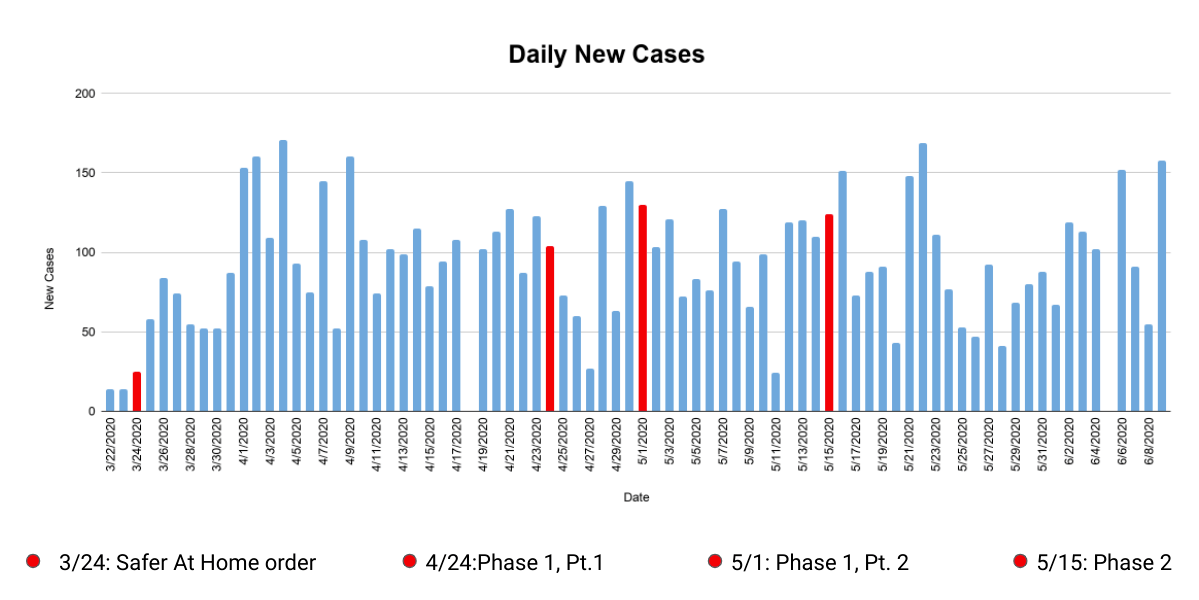
To create a rolling average, pick a day (let’s say June 4) then add up the number of new cases over a period of time leading up to that day (we’ll do seven days), then divide by the number of days. There were 637 new cases from May 29th to June 4th. Divide that number by seven to get an average of 91. The “rolling” part comes when you perform that calculation over a series of days, moving your seven-day lookback period along with it.
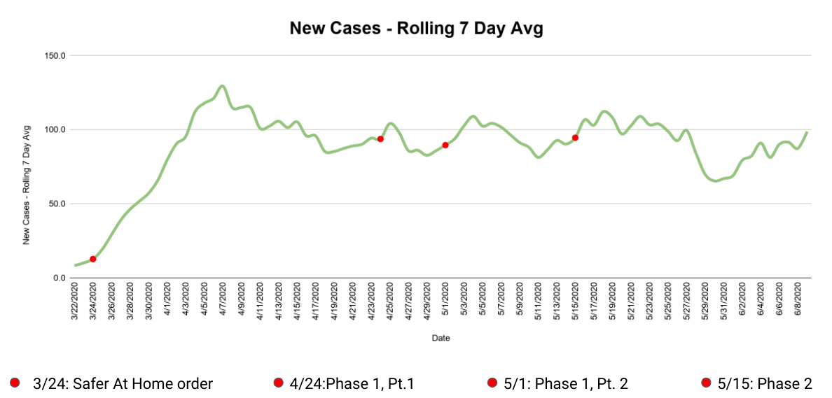
By putting that rolling seven day average of new cases on a graph over time, seen above, we can finally start to answer some of our questions. How has the virus spread over time? New cases were piling up at an increasing rate until the first week of April, then settled to an average of about 90 new cases per day until late May. There was a nice dip in the last days of May, but the first week of June has seen an uptick.
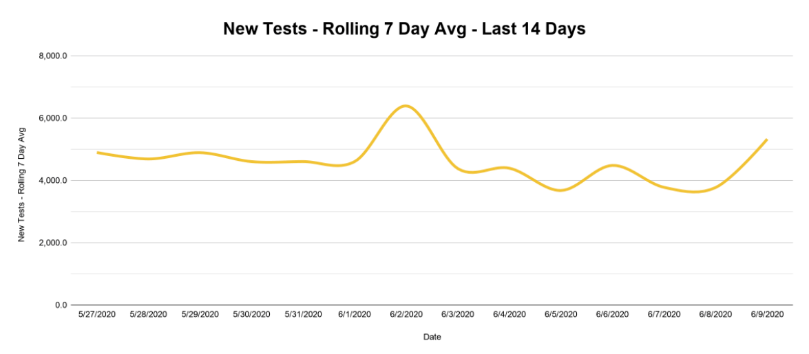
But new cases also have to be considered in relation to the number of tests administered, since the number of potential new cases recorded is limited by the number of new tests. So we need to know how much we’ve been testing over this same time period. Did we test a bunch at first and then stop? Are we testing more than we did at first? The rolling average helps us pull back the curtain and see the answers unveiled before our very eyes!
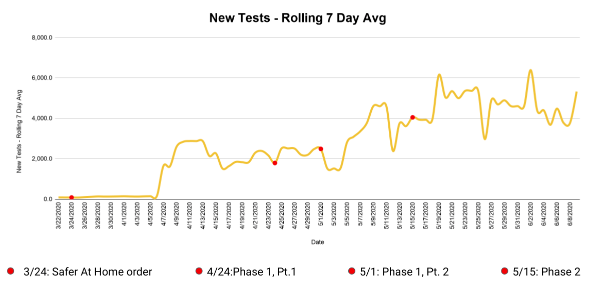
You can quickly see that Oklahoma got its first large batch of test results in early April and has steadily increased testing since. At 5,369 tests per 100,000 people, Oklahoma currently ranks 25th in the nation for testing per capita — only slightly behind the national average of 5,985. As long as this testing rate stays fairly steady, we can do a pretty good job tracking how quickly infections are spreading.
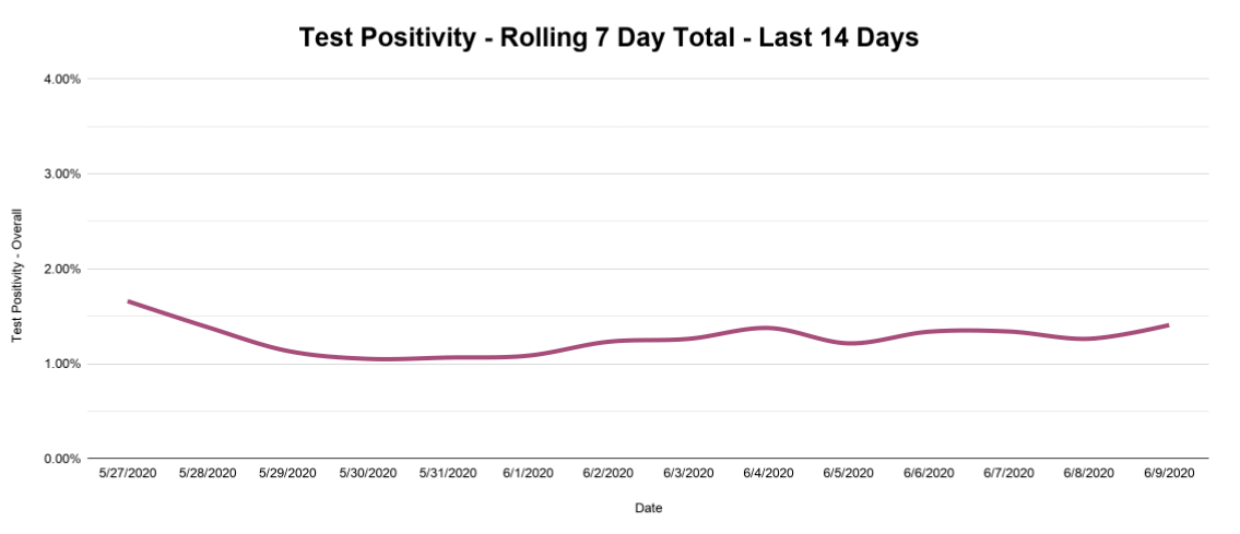
Which brings us to one last important metric: test positivity, which combines the previous two data points and shows the percent of new tests that come back positive. This number also jumps around from day to day, but we can again smooth things out with a rolling seven-day cumulative total (total positives divided by total tests over seven days) and get the nice, smooth trend line seen below.
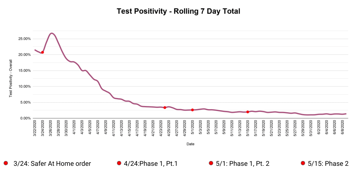
Now, test positivity can be a bit misleading. The very high test positivity in March looks scary, but that is expected, since tests were scarce and priority was rightly given to those showing symptoms. But the shape of this line (really high to really low) does not necessarily mean that the virus has slowed down. As more tests became available, more healthy people took the test and drove the rate down, even as the number of positives coming back hovered in the same range.
What you want to watch is the slope of the positivity line—is it pointing up or down? Now that we’ve achieved a fairly steady high rate of testing, we probably won’t reach those high early positive percentages again. What we need to know instead is whether the test positivity rate is going up and down. If that line starts rising, it will be one of the first indicators of the feared “second wave” of infection that could follow as we reopen parts of our society.
No matter what your opinions are on the machinations of public health, you deserve data that is clear and relevant to inform your decisions. And, if you know what to look for, that information can be close at hand.
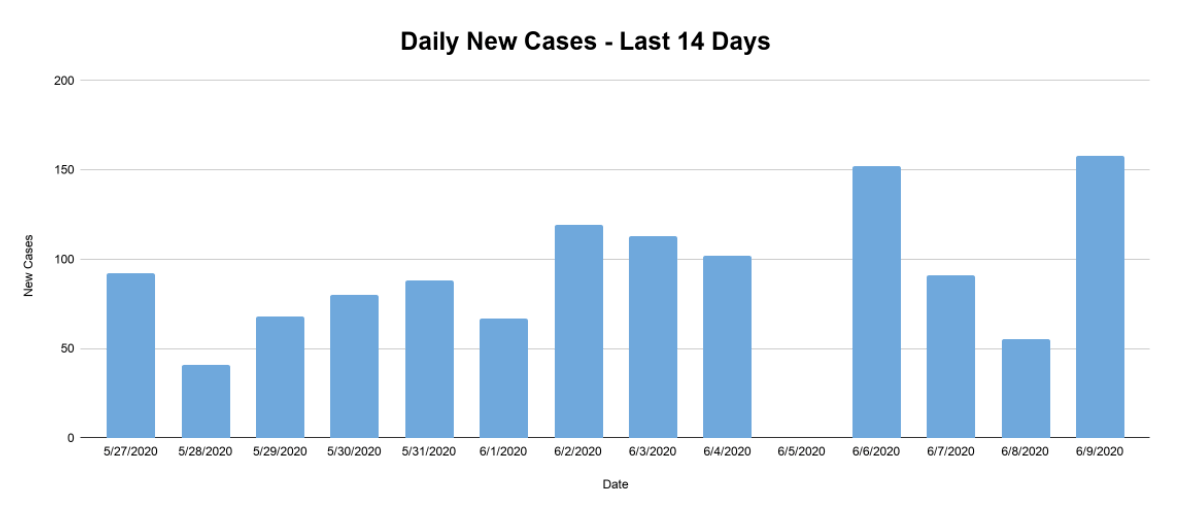
See below for the data above zoomed in on the past 14 days.


